Projects shown in this section of our portfolio represent what we consider general adult website designs.
Regardless of niche, they are typical of a classic walk-through adult website design, or ‘tour’ that consists of of 2-7 pages. While remaining as visually dynamic as many of our premium adult website designs, they tend to be less interactive than a fully transparent tour or episode-based layout. They give away less of your content and guide the surfer to your join page in a linear fashion.
-

A new, 2nd generation wide screen adult website design for SexSpy.com
-

1-shot landing page / graphic for industry giant porn.com
-

A unique, totally badass site design for XXX production studio First Strike
-

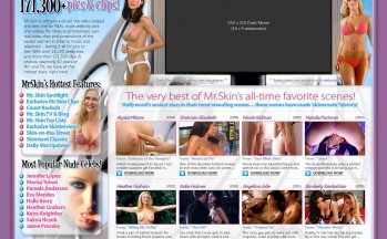
A more modern and widerVersion 2, adult site design for MrSkin.com
-

A widescreen site design for amateur giant wivesexposed.com site 2009
-

A great layout in a more modern design style, for an adult video production company
-

A slick looking, very graphical HD tour for this new Tranny site
-

A larger HD format tour for a popular MILF site
-

Sssh.com Version 3 of erotica site for women from 2008
-

Visually stunning design for an all-anal HD site for Silver Sinema 2007
-

A long- form style tour and join all-in-1 site design.
-

A nice magazine style site for an early women’s erotica site called 'For The Girls'

